- Blog
- Bitwarden Design: Updating Admin Views in the Web Vault
Last year Bitwarden released a web vault refresh focusing on the usability of the vault for end users and organization members. In an upcoming release, Bitwarden built a series of updates to improve usability for organization administrators and owners.
Understanding the opportunities
This refresh for admin views picks up where the earlier vault refresh left off. Prior to getting started on any solutions, the team organized user testing of the organization administrative experience. The Bitwarden design team wanted to observe how users were interacting with the product to discover areas to improve.
The usability test focused on understanding how administrators navigate the organization tabbed view and how they completed common actions while setting up their Bitwarden organization.
The results of these sessions showed that administrators new to Bitwarden could benefit from:
Improved expectations for each organization navigation tab: Vault, Manage, Tools, and Settings
Better definition of how the relationship between items, collections, users, and groups related to each other
Stronger consistency and easier navigation between the user, collection, and groups modals
Planning and content mapping
To improve administrators’ ability to anticipate where a setting is found in the Organization view, Bitwarden investigated in-depth the navigation for other commonly used IT administrative tools.
In the seven administrative tools reviewed, the following pages or options were most commonly found in top level navigation:
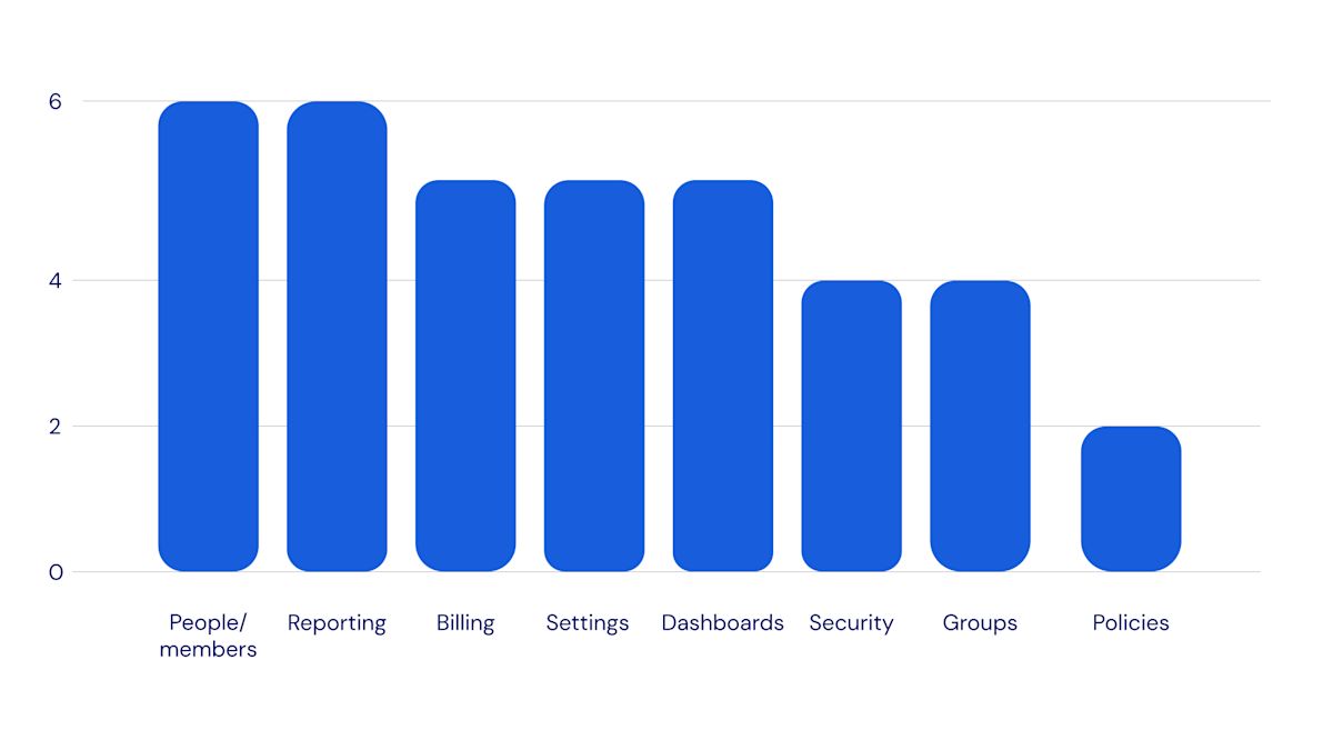
With this in mind the team compared the list with the common actions administrators often complete in Bitwarden. This resulted in the following reorganization of the Bitwarden Organization management view.
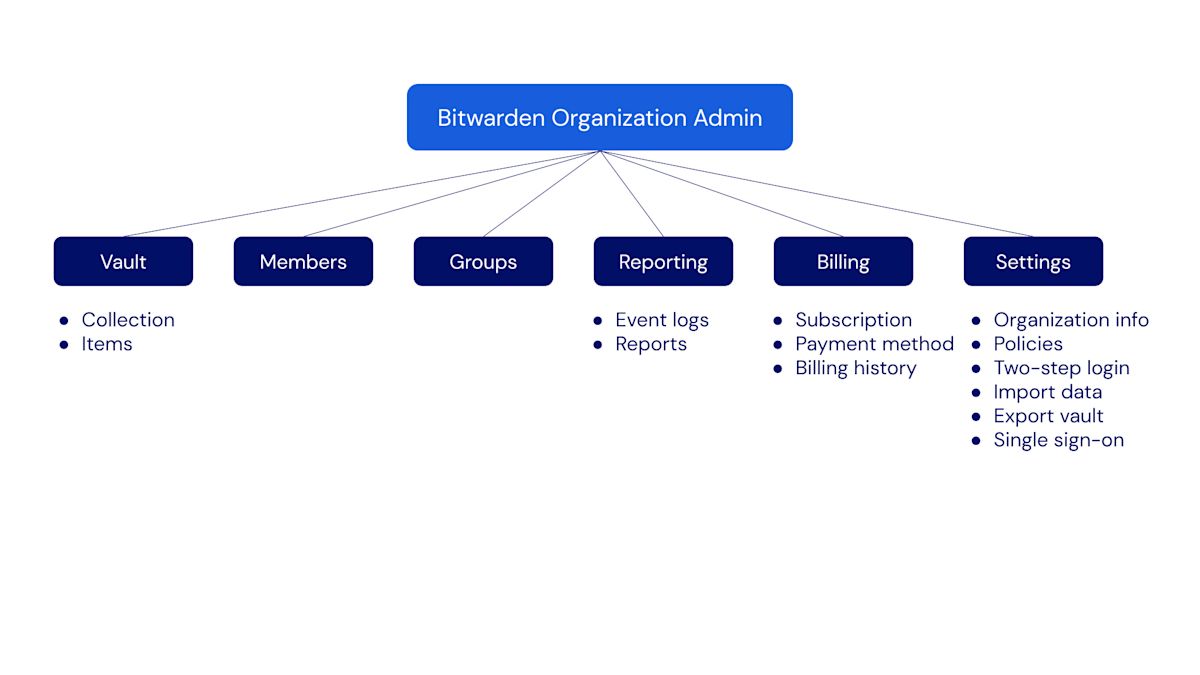
The revised structure emphasizes descriptive names for each of the administrative pages and clarifies the relationship between collections and items by moving collection management to the Vault page.
Developing the solution
To help improve understanding and intuitiveness of the various feature relationships in Bitwarden, updates were made to the Vault page, the Members Page, and the Groups page. New columns were added to each of them to show listed items’ attributes at a glance.
The Vault page

Collections are now shown in-line with vault items. Bitwarden members may still navigate the vault using the collection tree or they can drill down into nested collections using the list view.
A Groups column provides an at-a-glance understanding of who has access to each collection. This allows administrators to quickly see which groups have access to which collections.
The Members page
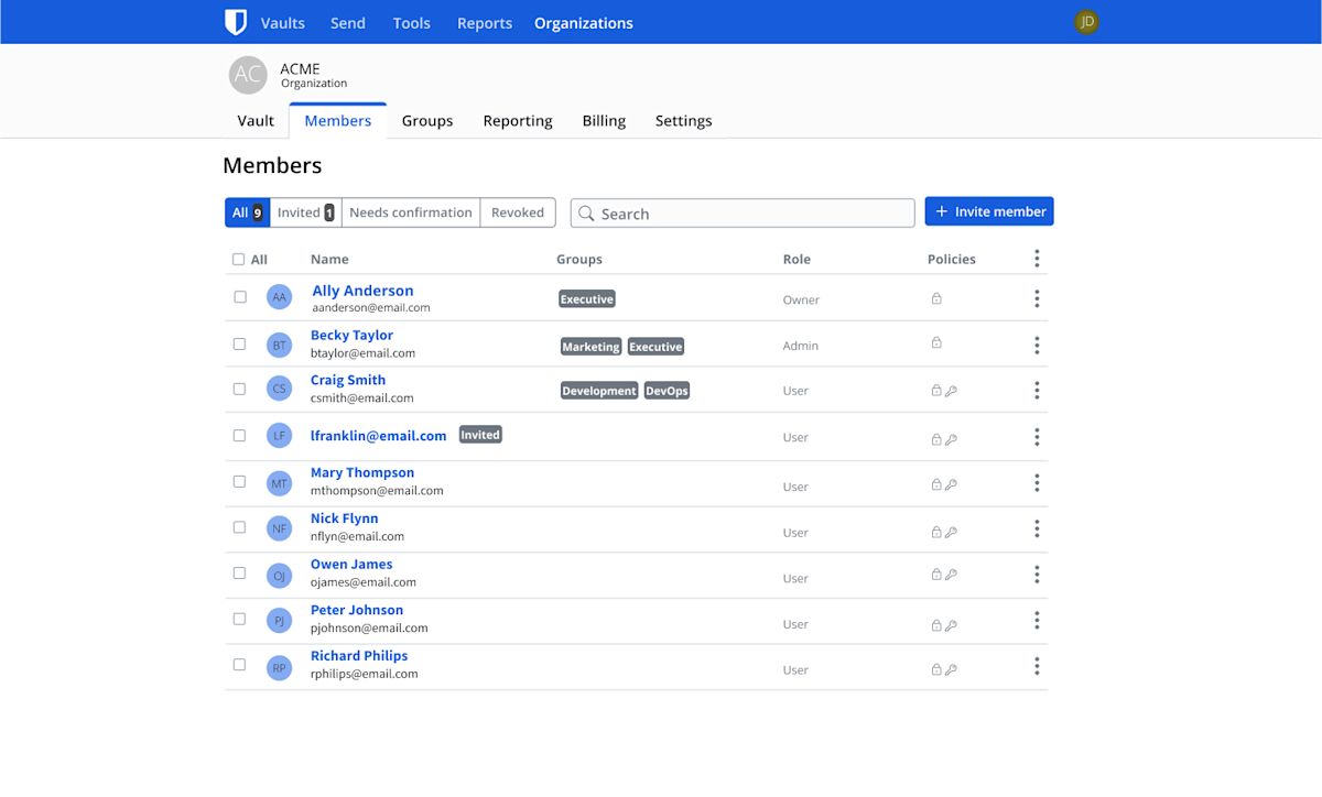
A Groups column was added to the view to allow administrators to quickly see which groups a member is in.
The Groups page
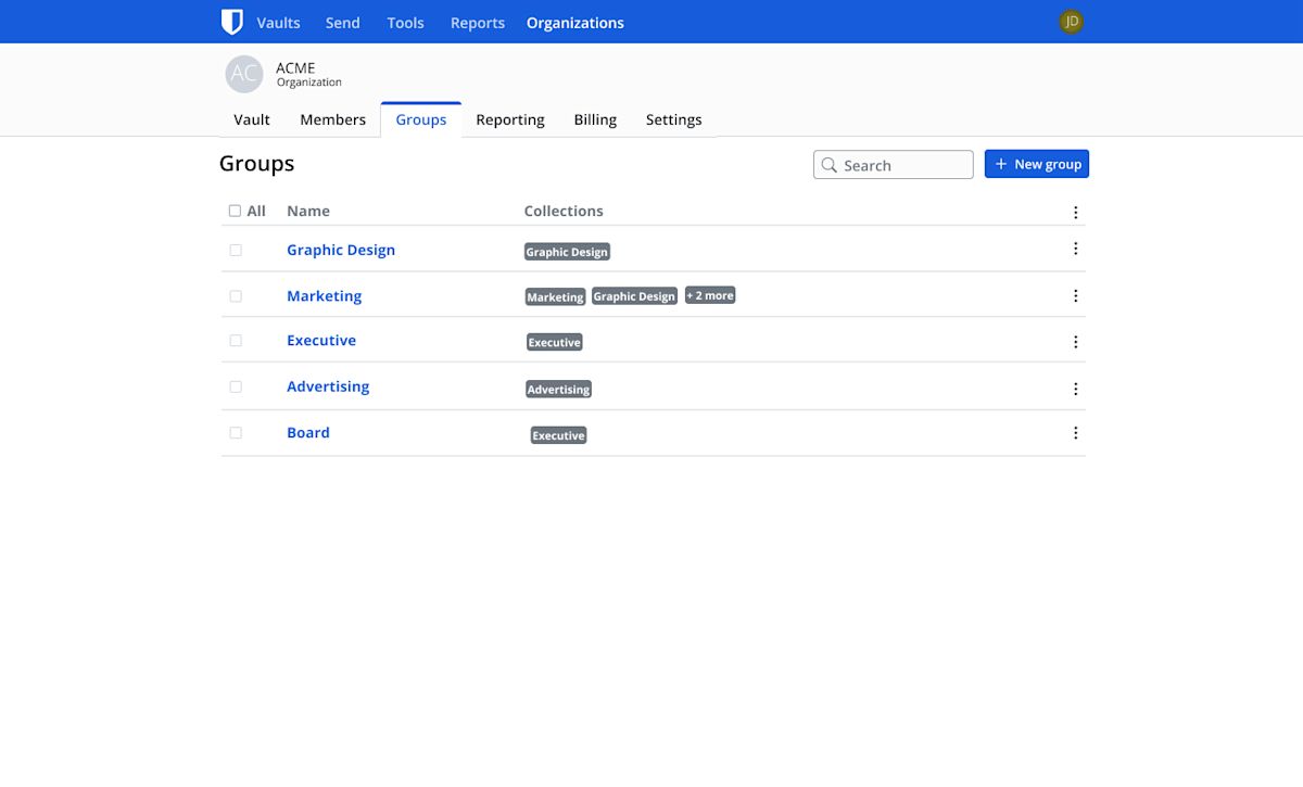
A Collections column can be used by an administrator to easily see which collections a group has access to.
Simplifying Modals
Finally, the last major update is to how an admin can add or modify groups, collections, and member relationships. Previously each respective page featured a modal where an administrator could edit an entity (user membership, collection, group) through a popup window. In this view, the administrator could edit only either the members or collections related to that entity and use the options menu (gear icon) to access the remaining relationship. There was room to improve the consistency in where these relationships were established throughout the three pages.
Bitwarden also received client feedback that this separation of members and groups often causes duplication of relationships when an administrator grants a member access to a collection where they already had access to through a group.
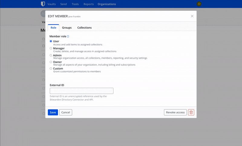
As a result, the team wanted to improve both communicating the relationship between these three Bitwarden entity relationships as well as the process for creating them. To achieve this, Bitwarden merged the two separate modals into a single view.
In each of the revised modals an administrator can create any of the relationships they desire. Each section is separated by a tab divider. This allows an administrator to create an entity and assign access all in one seamless action.
Testing and revision
With the revised content organization and modal interactions designed, the team proceeded to organize usability testing of the revised experience. Test participants were given similar tasks to the originally observed participants, this time using the updated design.
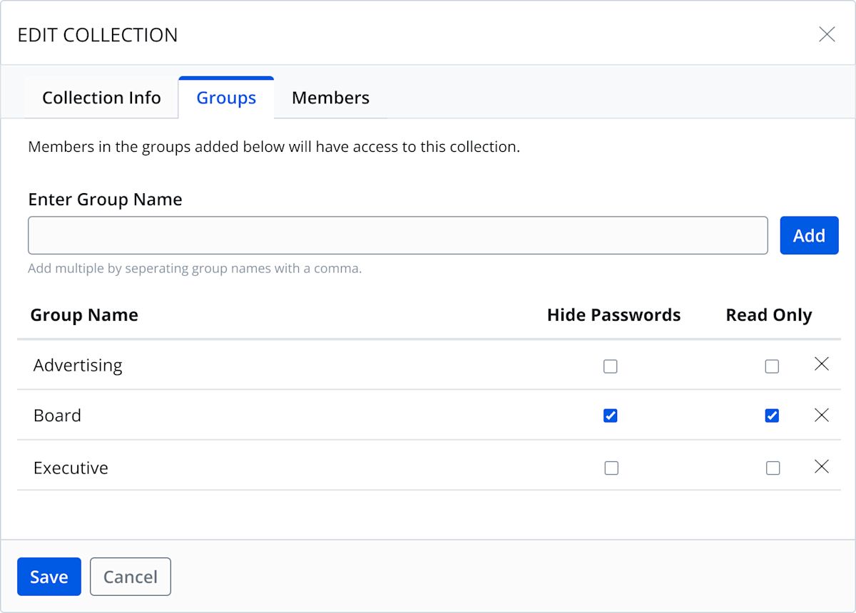
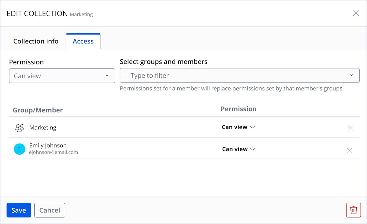
From the testing the team gathered additional insights and were able to further refine the direction of the updates. As an example, in one of the early concepts for the updated modal interface there was an “Add” button to finalize creating the relationship between a collection and users or groups. However, during user testing the team found many users missed this button. As a result, it was decided to remove the button and automatically add the users or groups to the collection when the multi-select menu is closed.
Early concept:
Refined design:
What’s next
These updates make it easier for administrators to manage their Bitwarden organizations and onboard new administrators and team managers. As always, user feedback is welcome from the amazing Bitwarden community that is always a source of valuable insights. This update today could not have been possible without the responses to our User Research category in the forums. If you’d like to participate in future feature development or testing, be sure to sign up for future research opportunities and thank you for your help!
Get started with Bitwarden
Interested in getting started with Bitwarden? Quickly sign up for a free Bitwarden account, or register for a 7-day free trial of our business plans so your business and team can stay safe online.
